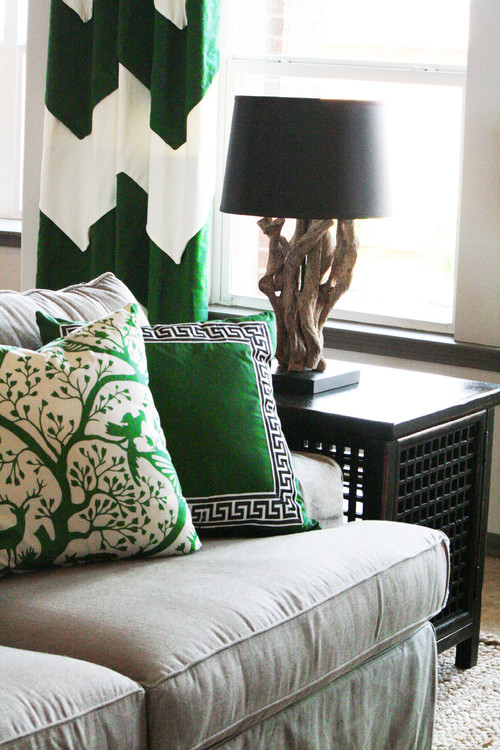
Everywhere I looked I saw green. The gorgeous, saturated, deep tones of emerald.
I've had this particular photo in my portfolio for some time now; I've always loved this space and I think the deeper, more vibrant greens are more glamorous and seriously under-utilized.
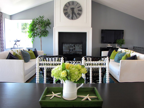
Here are a couple of other spaces that have a much less formal feel, but nonetheless utilize this deep and saturated tone. It's so elegant and fresh and can be used quite casually. Pair it with natural wood tones, charcoal gray, or black with gilded accents.
Here are a couple of other spaces that have a much less formal feel, but nonetheless utilize this deep and saturated tone. It's so elegant and fresh and can be used quite casually. Pair it with natural wood tones, charcoal gray, or black with gilded accents.
Check out the all-too-fresh chevron patterned draperies. I can't say I've ever seen them done in this deep emerald green and I would love to see them next to a darker wall.
Below: A casual, transitional space with punchy accents.
Eclectic Living Room design by Orange County Media And Blogs Tara Bussema
Here are some scenes that inspired me from our weekend at the cabin.
'Til next time!
xoxo
Rachel
Here are some scenes that inspired me from our weekend at the cabin.
'Til next time!
xoxo
Rachel


No comments:
Post a Comment